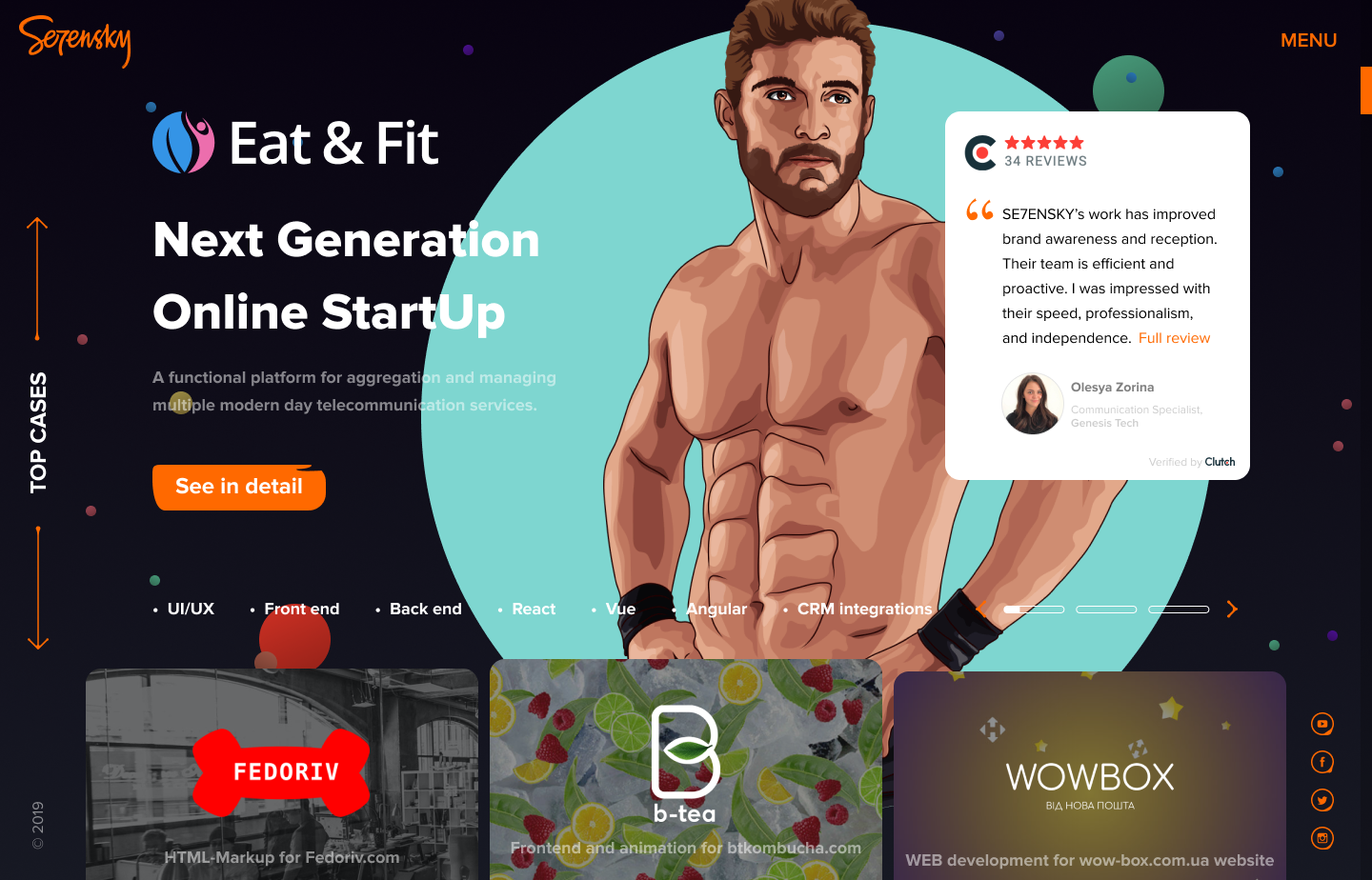
Our objectives were to create a website showcasing the best works of the frontend studio as mighty as possible. So I started with benchmarking and competitor research.

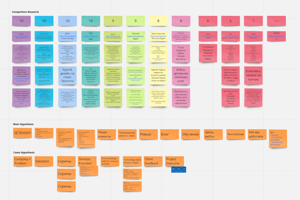
We collected some features we like and arranged them all by votes of the team. So we had some hypothesis on our future structure of the site. In the next stage, I started creating paper mockups, keeping in mind our objectives.

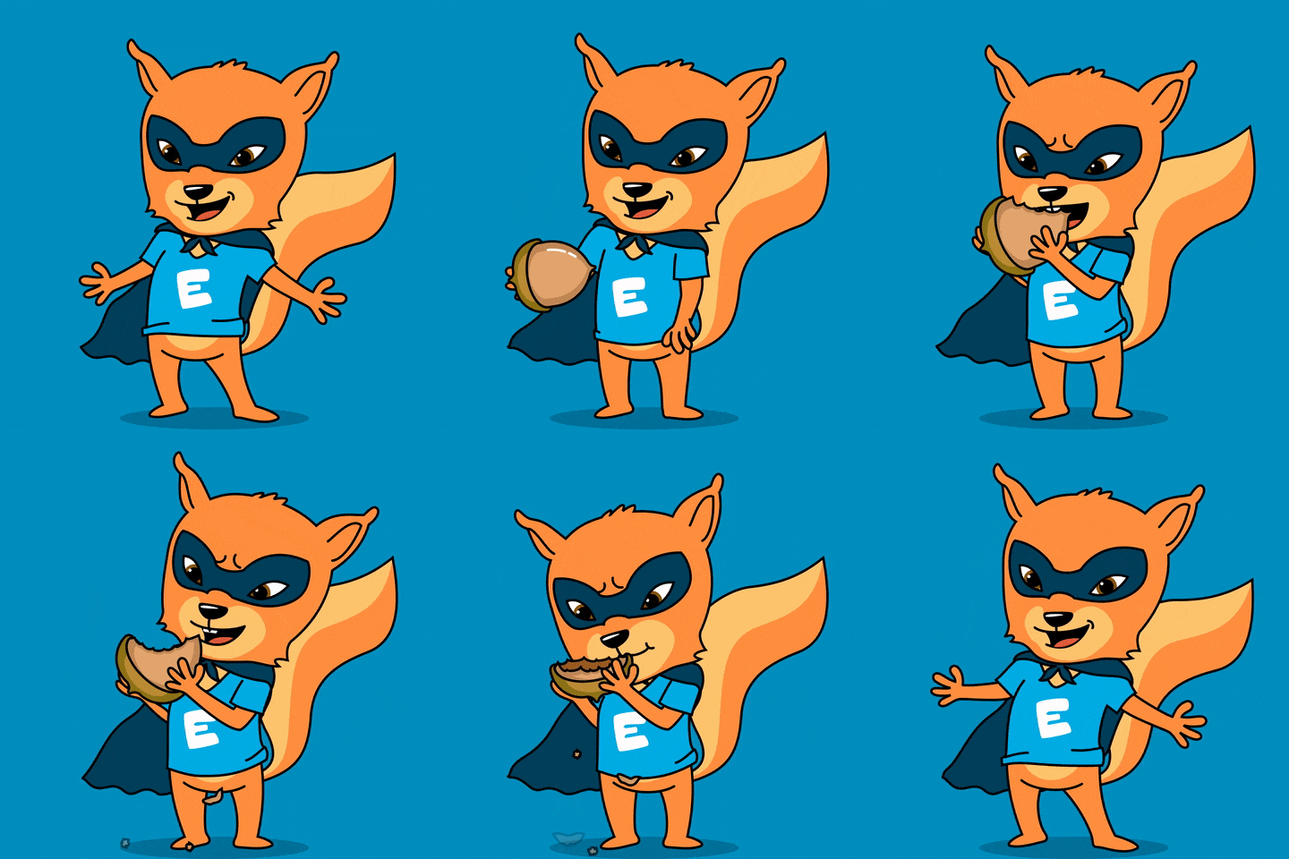
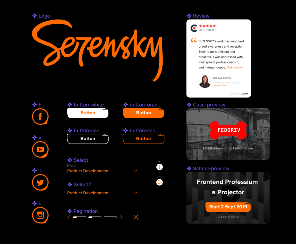
To convey a handcrafted approach of the Studio, reflected in their logo, I created the essential UI basis for a new website with handcrafted touch, keeping in mind its micro animation capabilities.
Basics
Beautiful section screens based on the created style
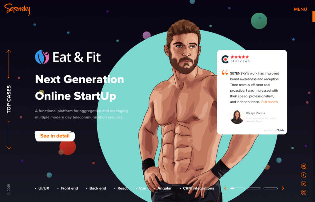

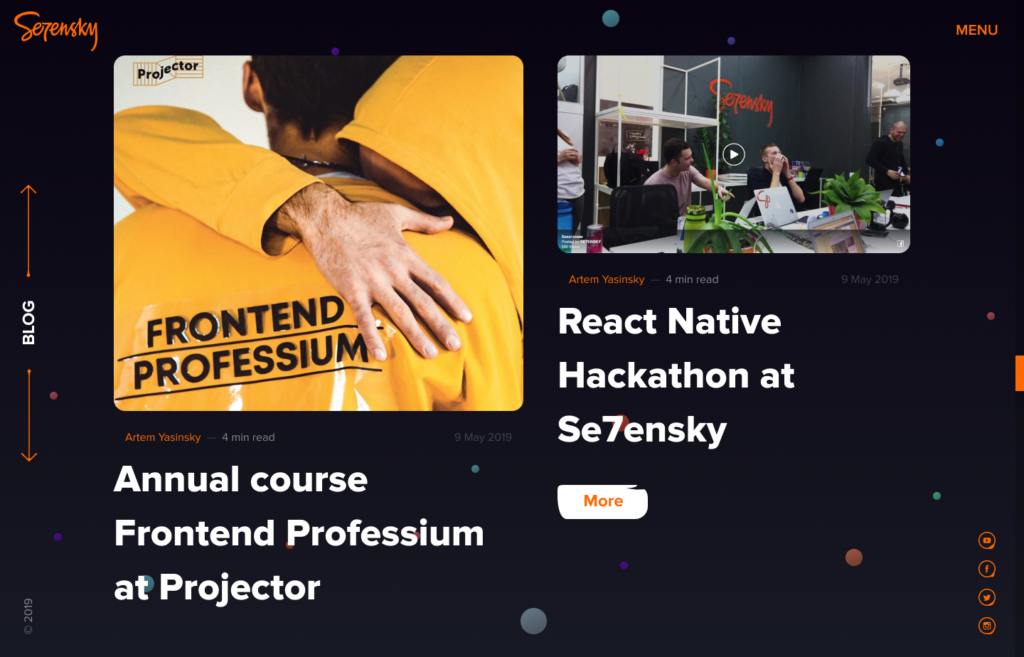

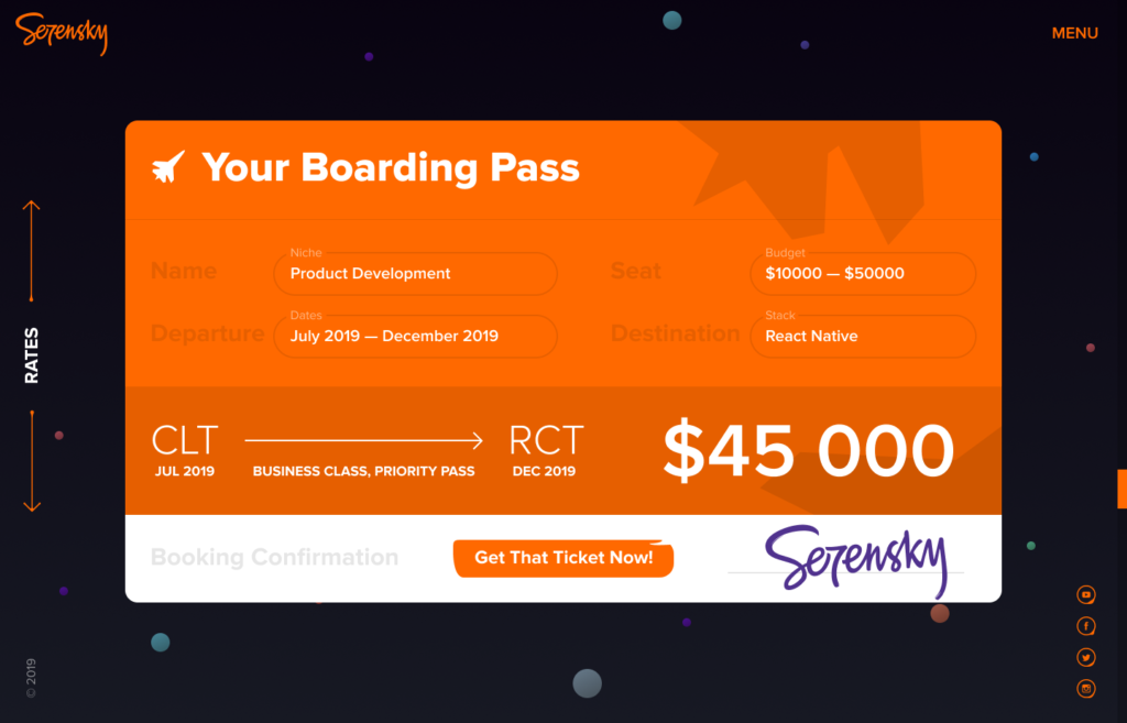


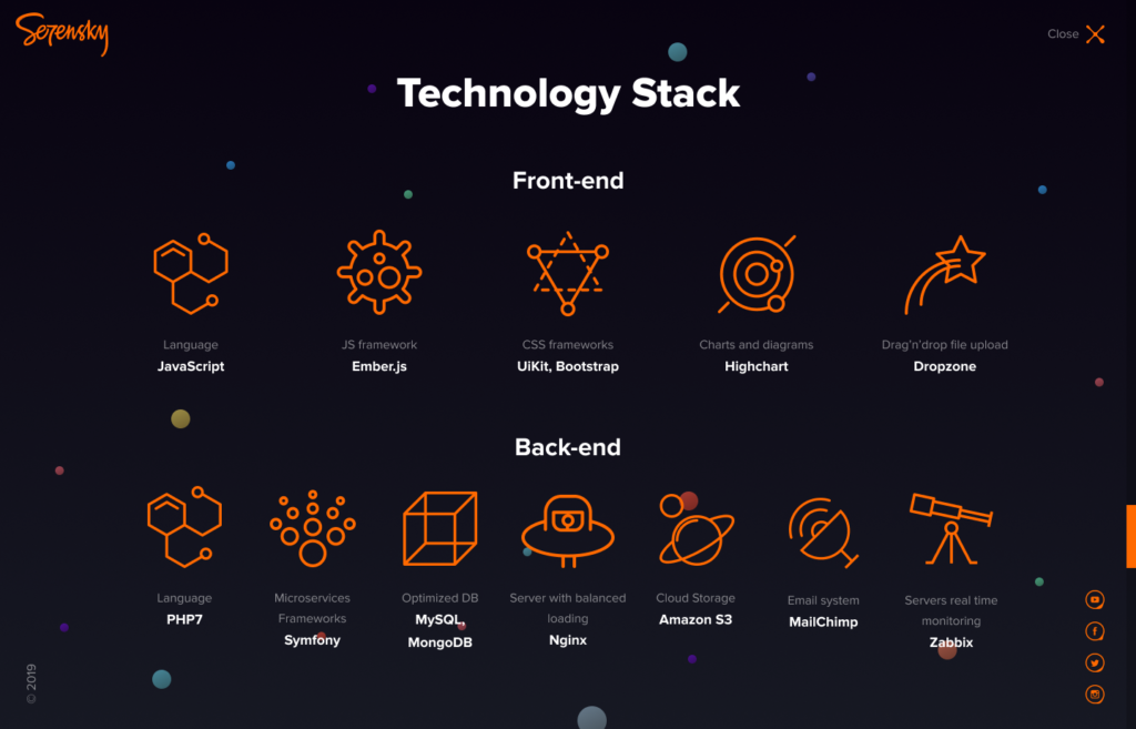
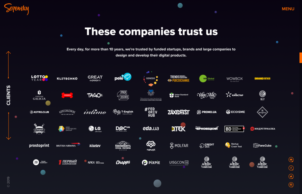
In the result we achieved sections with great potential for the portfolio customization and micro-animation.
But we couldn’t implement all the findings just because they were too advanced for the in-house development, so all these designs went into a drawer until better times.
